Previewing Color Separations

How to Preview Color Separations using the Acrobat Output Preview tool?

Did you ever need to confirm a color in a pdf?  Checking colors is a very important step ensuring the printing will be correct. A pdf sent to a printer should be CMYK. But what happens if the color should be a PMS color?

This month we’re going to show you how to preview colors in Acrobat.

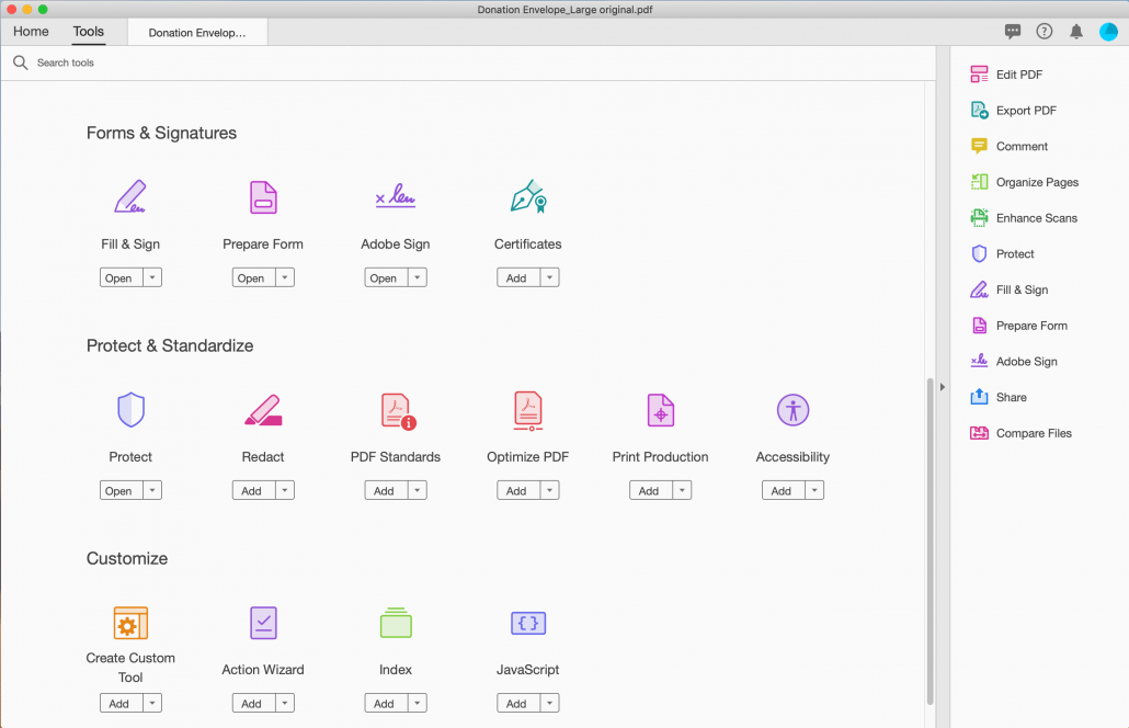
To do this open your pdf in Acrobat. After opening the pdf we need to confirm that the colors are what they need to be.  Next we open output preview by either opening the tools pallet and scrolling down to print production and clicking on the output preview. Another way is to do a search in the search tools. Typing output preview will also bring it up.

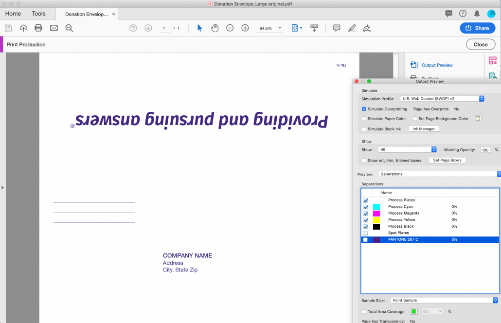
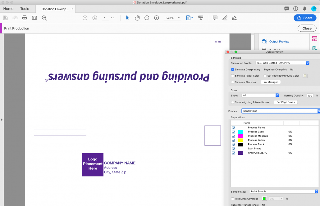
From here we can view colors by turning colors on and off individually.

In the pictures below turning off the PMS color reveals that only some of the art is PMS 267. This will need to be converted to the PMS in order to print correctly in one color.

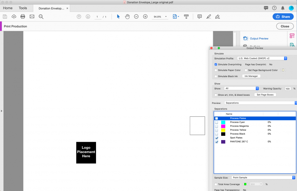
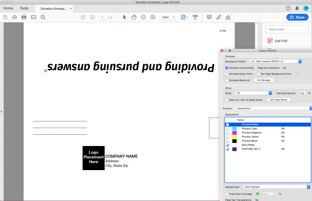
In the updated picture all of the art has been corrected to one PMS color.

Look for more tips every month at the Schneider Graphics website blog, schneider-graphics.com or if you need help give us a call at 847-550-4310.

Paper Finishes

How do you choose which paper to use for your next print project?

With so many weights and finishes available how can you be sure which is best for your design.

Determining which paper to use can be defined by the purpose of the project.

Coated papers have a clay coating added to them sealing the surface. After the coating is applied to the surface, rollers polish the paper giving it a smooth finish. This will restrict the amount of ink absorbed for a crisp defined dot.

Gloss papers are best when used with photographs. The smoother surface allows for sharper and brighter images.

Other finishes are Dull sometimes referred to as Silk, Velvet or Satin. These all have a coating without a gleaming like shine of gloss. These are also ideal with photos but without the surface shine.

Matte paper has a dull coating applied that has a non-shiny smooth finish that is excellent for color contrast and text. Matte paper has a unique combination of smooth texture and for easy readability.

Uncoated paper has a natural look. It doesn’t have an extra coating or paper finishing. Without a coating there isn’t a glare on the surface. This is ideal for writing, text or reading material.

Lately we’ve been seeing a big trend with dulls. People seem to like the way the inks still look vibrant but it’s not overly glossy which makes it easy for reading.

Schneider Graphics uses premium papers to make you look good. We don’t want to just be your printer. We want to be your go to resource!

Got questions or need help. Call us at 847-550-4310 or e-mail sales@schneider-graphics.com